On May 5th, I attended the SMP presentations in Art History by April Morgan and Erica Maust.
April's presentation was curatorial, an examination of artwork of St. Mary's students past. In her consideration of the artwork, she searched for a trend or change in curriculum that was documented in the history of the college as well as identifiable in the artwork. She stated that there was a tangible shift away from skill focus and towards an emphasis on idea, conceptual development, and diversity of source. This is a similar trend in the liberalization of the college evident throughout the past ~30 years that April examined. Out of all of this work, she selected a relatively small number of pieces that she considered representative of this trend and displayed them in the 3rd floor beanbag lounge in the library. As she mentioned in her presentation, the emphasis in pieces was on portraits and landscapes, but she chose a refreshing array of artwork in addition to this general standby for 2D art-- she included drawings, paintings, and a small amount of sculpture and even a video presentation.
It amazed me that April could base a whole SMP off of artwork only from this school, but I was surprised further that she could find as much as she did to talk about. (I suppose my concept of SMPs is still relatively highfalutin.) I found it interesting, however, that the works she was exhibiting showed a less-than-expected trend towards and not away from realism. Although it is typical that the exploration of further idea over skill and craft would lead to greater and greater nonrepresentationalism, the pieces April chose did not show this trend in the least-- indeed, paintings on a whole became less stylized, less painterly, etc. This begs the viewer to look further at the idea that must be nesting behind these works instead of using identifiability as the cornerstone for the concept of a focus on idea.
Erica Maust's presentation centered around a more cultural approach to art history. In her presentation, she introduced us to UNESCO, a worldwide organization dedicated to designating sites and manmade structures as historically and culturally significant. The designations made by this organization publicly peg these places, most often allowing them to become attractions for outsiders and tourists. Erica was interested in how this affected the culture and memory tied to these sites when they are closely connected to a community. She focused on two small towns and sites in Mexico, Palenque and Calakmul, which both consisted of indigenous populace and an ancient Mayan construction.
The consensus indicates that the inhabitants felt invaded by UNESCO, that they'd been impacted economically and felt personally affronted by the thrusting of their place into the public realm. Erica opened her presentation with an adage in Spanish reading "lo que es de todos, es de nadie," or that which is everyone's is no one's. This sheds interesting light on the idea that one collective people in these places must have over time began calling the ruin near them "theirs," and identifying with it... I hadn't before considered the impact it would make on their personal lives when the site was designated culturally or historically significant and made public. It makes sense that publicizing the site would feel as though the site is metaphysically taken away from the surrounding inhabitants. I find this an interesting study of heritage, its nebulosity, and the factors surrounding it; I also find it interesting that Erica focused her art history project not on what an ancient work of art can do for its contemporary viewers, but what the contemporary people can do to it and those involved with it, its "loved ones."
Tuesday, May 12, 2009
Artist Focus -- Jason E. Lewis
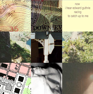
In his work Nine on The Thought Shop, Jason Lewis presents the viewer with a unique form of narrative. He introduces the viewer with an extensive, to the point introduction, explaining that the images and the text are representations of the artist's life. The viewer is to click and drag to move the images within the grid, which causes the text to shift and the images, in their individual and movable cells, fade and shift to become other images. Lewis states that his ambitions in this project are to bring into focus the idea of a nonlinear life, one marked by "demarcations, shifts in place, shifts in community, shifts in attitude" that act in persistent memory as cornerstones to new "lives," as it were. These important memorial demarcations are well-photographed but enlarged or slightly abstracted images of landscape, faces, maps, objects, trees. As the participant moves through the images like one of those puzzles with the sliding tiles (what ARE those things? do they have a name?), the pictures fade rapidly and randomly into other images. As they are moved, the text in the one empty spot always occurs in the same order. At first, I was hesitant to move in too random of an order, in case I messed up the narrative in the text; however, the more I moved around the image tiles, the more I found that the phrases presented themselves in the same chronological order no matter how I arranged the images.
It's a legitimately interesting idea of memory and reality that Lewis deals with in this project; in presenting the story in the same chronology but the "memory" images in a highly variable combination each time the viewer interacts with it, Lewis confronts the viewer with a very tangible sense of objective memory one can realistically bestow on a listener (the text) and subjective, mutable memory thought accessible only to the thinker (the images). I'm reminded of the Cubists attempts to capture the process of sight in their paintings; the presentation of fractured image, according to some of the writings of Braque and Picasso, were to infer the fact that we take in objects bit by bit, with each bit magnified and specialized in its own way. Although cerebrally, this process makes sense, the Cubist paintings lose a lot of this notion when standing on their own. In a way, Lewis's work achieves a concept of thought and memory process better and more conveyable than the Cubists were able to achieve. I think it's the fact that the temporal dimension was introduced is what sets this work apart in terms of readability; as the story progresses in the set way, the non-negotiable way, the images change, ebb and flow like clouds. It is the fact that we can chart the change, that we ourselves utilize memory to explore this consciousness, that we can understand the dual processes of thought. It is owing mostly to the new media setting that this is really conveyable.
Personally, I like the fact that different arrangements have significantly different emotive messages. When we rearrange the images, the change and form their own gestalt, which has its own emotion and its own message regardless of the repetitive text: some are calm and serene, some seem cold and unfamiliar, others a little intimidating. In this way, I can see why Lewis chose to consider his piece "poetry" in the intro description.
Sunday, May 10, 2009
Artist Focus -- Cory Arcangel
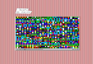
DATADIARIEZZZZZ seems to be the most well-known work of Cory Arcangel's, if not his only work of which to speak. The work, according to the introduction page, is the result of Cory's own computer hacking. Somehow, Cory placed the memory of his computer (his computer? our computers?) and plays it back in the form of visual colors and shapes. The viewer can choose the data from a given day in January of a determined year and view all the data left from the actions of the day.
The intro page prides Cory Arcangel's project as a work of art taking little to no effort or rumination. It gladly acknowledges that Cory Arcangel cannot realistically be considered even an artist, web-artist or otherwise. I suppose there's a certain interest in the "phenomenon" that a series of visually appealing nonrepresentational, colorful videos were produced "accidentally" by a non-artist. Perhaps we can file this under the movement of quotidian art, under that ultra-modern and ultra-liberal concept of art as accident, art as incidental, art as almost everything. I suppose some might view Cory's videos and remark upon the visual appeal, even a sort of poetry to the change of colors, shapes, distributions... an emotive response to the flow and the color, as if we're reading something personal from, as the website titles the work, a diary of a non-human. Yes, it would be possible for the viewer to squeeze visual and poetic value out of this sort of work.
I'm conflicted when I view this, however. In the last word of the previous paragraph, I specifically used the term "work;" perhaps we should be asking ourselves as viewers as this piece, this experimental and almost flippant arrangement of html, can honestly be considered the result of labor and care as the term "work" implies. I am troubled when the intro page readily backs the fact that Cory is not an artist in the most familiar and conventional term, but that (in suggestion) his website should be acknowledged as art. 19th century art critic Aurier said that to create art, an undertaking of transcendent nobility, should be to represent “the highest and most truly divine in the world … the only thing existent – the Idea." Like so much other contemporary and modern art, I see no divinity in this work, no great idea, no weighty undertaking. I will consider Datadiaries a web experiment, but I will give it no adjective higher and more respecting than "cool." It is certainly clear that Cory Arcangel is no artist; therefore, I am hard pressed to call his production art.
Saturday, May 9, 2009
Artist Focus-- David Crawford
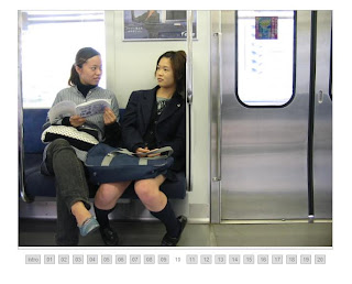
In Crawford's project, Stop Motion Studies, the artist took series of photographs of common people occupying public space. His focus upon the riders in the Tokyo subways was the major stop motion study I watched. In the study, Crawford focuses upon one person or one group of people at one time, then collects approximately 5 or 6 pictures of the subject in a quick succession-- enough to infer motion when placed in order and played forward. Crawford did just that in arranging these similar but subtly different images in an order and allowing the accessed image to play in a loop. Perhaps the images are not ordered, but dispersed and placed alongside one another to appear to be moving in a subtly differentiated but nevertheless repetitive way. In any event, the result is a montage of images that appear to play back the actions of a specific individual or group on the subway over a span of time.
To play back this tiny series of actions on loop, the total series in each case documenting probably less than thirty seconds of action and interaction, gives the illusion that the actions are repetitive over a long span of time. Other stop-action films and photomontages use photos taken over a span of time (such as every minute, every ten minutes, every hour) for an extended period time, then play them back chronologically to allow us to see a grand sort of change and pattern in the larger world. Essentially, stop motion functions to show larger change "in real time," in a way comprehensible in an incredibly reduced period of time. It makes the macroscopic microscopic so we can better understand it. This work of stop-motion, however, shows the movement and the progress of just a moment across an infinite span of time--- herein, it essentially does the opposite of what a typical stop-motion film does, making the microscopic macroscopic.
It seems to me that this is Crawford's genius: he gives us the opportunity to not just indulge in a sort of voyeurism to better understand quotidian people in their natural habitat, but to boil down this experience to one moment and freeze it, allowing us to explore the moment so much more intimately. It's an almost Impressionistic version of the flaneur, exploring a frozen (yet actively moving) moment in a frame to understand the state of their lives, of Paris better. I think the way Crawford lets us explore the multitude of different expressions and actions captured-- humorous, dramatic, serene, and so on.
Monday, April 27, 2009
Artist Focus -- Pac Manhattan
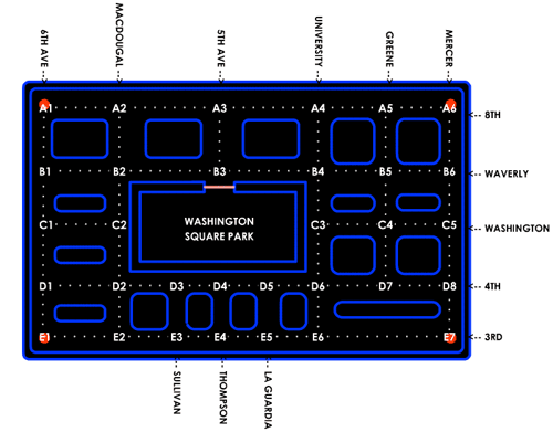
In this collaborative project, a group of young adults organized efforts, costumes and rules to recreate the game of Pac Man in a real life setting. Essentially, one player donned a "pac man" esque costume, then entered the streets of Manhattan to "eat" all the "dots" of a predetermined section of streets and avoid being eaten by the ghosts, who were acted by 4 different players. The players active on the street are not acting of their own volition: they are given direction via walkie-talkie for direction and action by a remote player. This player is able to track the progress of the Pac Man on a gridlike map, seeing where he has gone and where he can go.
In a manner very similar to the game, contact with the ghosts would lose lives/the game, and reaching a certain point would allow the Pac Man to gain the ability to "eat" the ghosts. The act of "eating" things was modified in the real world setting by tagging (ie, a ghost tags Pac Man or vice versa). Instead of eating the "dot" that allows the Pac Man to eat the ghosts, the Pac Man touches the sign at the predetermined intersections on streets. The Pac Man does not exactly "eat" or tag dots as he travels through the street maze, but they are automatically deleted as he travels once over any one of the paths necessary for finishing.
While it is far from rare for me to get excited over a work of art, really interesting or stimulating works have been rather hard to come by at least in my previous experience in the New Media department... However, this work caught my interest and kept it. It was immediately attention-grabbing and clear in the message and motive (breaking the game out of the context of the screen) and actually had a readable sense of humor. All these things make for a rare combination.
But even so, can it really be considered a new media art project? Unlike most of the works discussed in this project, from music to interactive games and narratives, this work does not occur on the internet. The records of its occurrence are on the internet, sure, but the internet is not its natural habitat. The players don't live in the digital realm, either, but literally run around to complete the project. In most ways, I can see how this project would be considered a performance art piece. Let's not forget, however, that the project is wholly dependent on the use of technology in the hand-held screens and communication from player to Pac-Man. Without the communication, the work would be chaotic, slow, and relatively anarchistic... with the role of tracking devices and communicating devices, the work becomes most like the game. Not only is there a game board and moving, interactive pieces, but there is a controller who has omnicient control over the entire grid. This can only really be possible with the role of new media, which most solidly categorizes it as such.
Sunday, April 26, 2009
Psychogeography Response /// Alternative Map
I find it interesting that “This American Life” describes alternative maps, specifically those created by Denis Wood, as “more like novels, trying to describe everyday life.” Sure, some of these maps describe lifestyle observations within the landscape that can be organized and presented: this might include the map of Jack o’ lanterns around the neighborhood on Halloween, or Toby Lester’s map of ambient sounds. In these creations, these men are mapping aspects of their lives pertinent specifically to their lives, making their creations into personal novels, in a way. But many of the subjects within the maps seem distant from the lives of the mapmakers. The maps of street lights, water lines and hydrants, and power lines jump to mind. As the This American Life article mentioned, “Mapmaking means ignoring everything in the world but the one thing being mapped, whether it's cracks in sidewalks or the homes of Hollywood stars.” Thus, if the maps of the areas had every single different element being mapped under a different layer in Photoshop, the artists have turned off the visibility of every element but the visibility for the mundane-seeming element we are presented. But why are these mapmakers outlining these details of their personal space and not any others?
To create a map of something is to honor it, in a way: this something is a mark or series of marks on a landscape important enough to be comprehensively outlined. That a map exists to document where this aspect of the landscape can be found implies that someone is interested in looking for it. A map, after all, carries the connotation of utility. So, in essence, these artists are placing special emphasis on their chosen focal points to imply a user who needs this information or is specifically interested in this information. Perhaps this is nothing more than a Dadaist, Surrealist exploration of Baudelaire’s idea of a “flaneur,” as the Wikipedia article on psychogeography suggested. From my experience in my Modern Art History class, this would imply that the artists are playing the part of an objective eye, a roving and observing gentleman in the context of modern urbania--- but one who assaults the everyday understanding of a map with the presentation of the absurd (but perhaps arbitrary) element or one who forces the viewer to understand the landscape in a psychologically-troubled, perhaps obsessively-counting, paranoid sort of manner. (The Surrealists were big on troubles of the mind.) While I can see the confrontational pursuit and potential impact of the early psychogeographers, I hardly think these contemporary mapmakers carry the political and socially-upheaving attitudes of these earlier artists and those of the Dadaist affiliation on a whole.
No, I think these specific artists are perhaps attempting in creating maps (and, therein, paying homage) to their selected elements to force the audience to consider the wealth of complexity in any given location and the impact it has on our lives and others’ lives. Sure, one might look at the maps of power lines and think of the electricians and construction workers who must know a map like this rather intimately—but I also see a map like this one and think of the real importance of the element, even to myself. While it’s easy to consider things like road maps the only documentations of important aspects of our surroundings, these maps document paths and locations of elements essential to our daily lives. Even if we have no intention of using the map to follow on foot to see the different locations, we might see the map and marvel at (or just chew over) the prevalence of that element, the organization, the dissonance from the landscape we’re used to.
This refers only to the newer manifestations of this idea… clearly, there is a rift between these newer maps and the older forms. It seems to me that the most all-encompassing statement for both manifestations is that “By definition, psychogeography combines subjective and objective knowledge and studies.” For the older artists, like Debord, this involved combining what he called “hard ambiance,” or physical reality, with “soft ambiance,” or a cognitive/emotional association or sensory association. It seems that newer artists pursue the same basic combination of information, but they tend to present a pointedly unorthodox element of objective knowledge that can more subtly and comprehensively imply a subjective knowledge. Debord and his associates stopped the creation of their psychogeographic maps due to the observed “relativity” of the landscape, in which idea or emotion could never be fully expressed to another by any means of retelling. Perhaps this modern manifestation was a way to solve this problem.
So how can I meld the subjective with the objective to create an interesting, engaging, off-beat alternative map of St. Mary’s? How can I ignore every part of the campus but the part I am most interested in?
-I could create the naturalist guide to St. Mary’s. Not a totally subjective account, but not completely objective either. Documenting animal spottings, good hiking and biking trails, good smells, pond smells, hard trees to climb, easy trees to climb, best places to find edible plants, where to watch out for poison ivy, etc…
-After a painful breakup last week, I could create a map of all that nonsense just to put it to rest… where we met, where we did this and that, how we broke up… but isn’t is boring when art projects are too esoteric?
-I could map out the different chairs and benches around campus--- all the different public places to sit. Maybe that’s a little too pointedly knocking off of Denis Wood’s work, and maybe it doesn’t mean enough to me… but I do entertain a minor fondness and fascination with chairs.
-That’s all I can think of for now.
Tuesday, April 14, 2009
Artist Focus -- Matthew Richie
Matthew Richie is presented as a highly cerebral artist, creating complex works of art in physical in digital media to reflect structure and classification within the realm in which he is concerned. He has created interactive interfaces able to produce different outcomes based on the different paths taken within the large number of different characters and settings developed. His completed product of this sort is The New Way, a complex system involving 49 characters, broken into 7 groups of 7, able to interact in a likely-infinite number of different paths. The object of this, however, not about the numeric possibilities, but was created to represent "the story of origins, or genesis and fall, as a metaphor for the construction of art" (Richie, 1995).
Is it that simple? Richie describes his actions slightly differently on The Hard Way introduction page, describing the process of its story to represent the "nature of information" and "a model of thought, an algorithm for consciousness" (Richie, 1996). On both the SFMOMA page and the introductory page for The Hard Way, Richie puts his work in the context of the slogan/idea "everything is information." What could be meant by or understood of these conflicting definitions or methods for understanding this work?
My experience of The Hard Way was relatively brief, browsing through the initial plotline and the first initial characters I could choose as my own. Richie introduces the experience as being one of the Watchers, or fallen celestial entities, as they interact with the Watched entities later. The choices of Watchers are represented as blipping shapes, which can be clicked for a profile and chosen or not chosen. The different Watchers are different sections of the brain involved in unique cognition or operative skills. He goes on to embody these brain representations with paintings, elaborate stories one must scroll horizontally to read (I find these difficult to understand the first way through), and so on. In this, he introduces a strange dichotomy of emotion and biology behind art-making and cognition. If this work is about making art, these Watchers must portray the different specific mental functions an artist might choose to work with (rational, irrational, carnal, etc) and the emotional implications therein. A similar concept is true if this is to be interpreted as cognition as a whole.
more thinking to come.
Subscribe to:
Posts (Atom)