I find it interesting that “This American Life” describes alternative maps, specifically those created by Denis Wood, as “more like novels, trying to describe everyday life.” Sure, some of these maps describe lifestyle observations within the landscape that can be organized and presented: this might include the map of Jack o’ lanterns around the neighborhood on Halloween, or Toby Lester’s map of ambient sounds. In these creations, these men are mapping aspects of their lives pertinent specifically to their lives, making their creations into personal novels, in a way. But many of the subjects within the maps seem distant from the lives of the mapmakers. The maps of street lights, water lines and hydrants, and power lines jump to mind. As the This American Life article mentioned, “Mapmaking means ignoring everything in the world but the one thing being mapped, whether it's cracks in sidewalks or the homes of Hollywood stars.” Thus, if the maps of the areas had every single different element being mapped under a different layer in Photoshop, the artists have turned off the visibility of every element but the visibility for the mundane-seeming element we are presented. But why are these mapmakers outlining these details of their personal space and not any others?
To create a map of something is to honor it, in a way: this something is a mark or series of marks on a landscape important enough to be comprehensively outlined. That a map exists to document where this aspect of the landscape can be found implies that someone is interested in looking for it. A map, after all, carries the connotation of utility. So, in essence, these artists are placing special emphasis on their chosen focal points to imply a user who needs this information or is specifically interested in this information. Perhaps this is nothing more than a Dadaist, Surrealist exploration of Baudelaire’s idea of a “flaneur,” as the Wikipedia article on psychogeography suggested. From my experience in my Modern Art History class, this would imply that the artists are playing the part of an objective eye, a roving and observing gentleman in the context of modern urbania--- but one who assaults the everyday understanding of a map with the presentation of the absurd (but perhaps arbitrary) element or one who forces the viewer to understand the landscape in a psychologically-troubled, perhaps obsessively-counting, paranoid sort of manner. (The Surrealists were big on troubles of the mind.) While I can see the confrontational pursuit and potential impact of the early psychogeographers, I hardly think these contemporary mapmakers carry the political and socially-upheaving attitudes of these earlier artists and those of the Dadaist affiliation on a whole.
No, I think these specific artists are perhaps attempting in creating maps (and, therein, paying homage) to their selected elements to force the audience to consider the wealth of complexity in any given location and the impact it has on our lives and others’ lives. Sure, one might look at the maps of power lines and think of the electricians and construction workers who must know a map like this rather intimately—but I also see a map like this one and think of the real importance of the element, even to myself. While it’s easy to consider things like road maps the only documentations of important aspects of our surroundings, these maps document paths and locations of elements essential to our daily lives. Even if we have no intention of using the map to follow on foot to see the different locations, we might see the map and marvel at (or just chew over) the prevalence of that element, the organization, the dissonance from the landscape we’re used to.
This refers only to the newer manifestations of this idea… clearly, there is a rift between these newer maps and the older forms. It seems to me that the most all-encompassing statement for both manifestations is that “By definition, psychogeography combines subjective and objective knowledge and studies.” For the older artists, like Debord, this involved combining what he called “hard ambiance,” or physical reality, with “soft ambiance,” or a cognitive/emotional association or sensory association. It seems that newer artists pursue the same basic combination of information, but they tend to present a pointedly unorthodox element of objective knowledge that can more subtly and comprehensively imply a subjective knowledge. Debord and his associates stopped the creation of their psychogeographic maps due to the observed “relativity” of the landscape, in which idea or emotion could never be fully expressed to another by any means of retelling. Perhaps this modern manifestation was a way to solve this problem.
So how can I meld the subjective with the objective to create an interesting, engaging, off-beat alternative map of St. Mary’s? How can I ignore every part of the campus but the part I am most interested in?
-I could create the naturalist guide to St. Mary’s. Not a totally subjective account, but not completely objective either. Documenting animal spottings, good hiking and biking trails, good smells, pond smells, hard trees to climb, easy trees to climb, best places to find edible plants, where to watch out for poison ivy, etc…
-After a painful breakup last week, I could create a map of all that nonsense just to put it to rest… where we met, where we did this and that, how we broke up… but isn’t is boring when art projects are too esoteric?
-I could map out the different chairs and benches around campus--- all the different public places to sit. Maybe that’s a little too pointedly knocking off of Denis Wood’s work, and maybe it doesn’t mean enough to me… but I do entertain a minor fondness and fascination with chairs.
-That’s all I can think of for now.
Sunday, April 26, 2009

Tuesday, April 14, 2009
Artist Focus -- Matthew Richie

Matthew Richie is presented as a highly cerebral artist, creating complex works of art in physical in digital media to reflect structure and classification within the realm in which he is concerned. He has created interactive interfaces able to produce different outcomes based on the different paths taken within the large number of different characters and settings developed. His completed product of this sort is The New Way, a complex system involving 49 characters, broken into 7 groups of 7, able to interact in a likely-infinite number of different paths. The object of this, however, not about the numeric possibilities, but was created to represent "the story of origins, or genesis and fall, as a metaphor for the construction of art" (Richie, 1995).
Is it that simple? Richie describes his actions slightly differently on The Hard Way introduction page, describing the process of its story to represent the "nature of information" and "a model of thought, an algorithm for consciousness" (Richie, 1996). On both the SFMOMA page and the introductory page for The Hard Way, Richie puts his work in the context of the slogan/idea "everything is information." What could be meant by or understood of these conflicting definitions or methods for understanding this work?
My experience of The Hard Way was relatively brief, browsing through the initial plotline and the first initial characters I could choose as my own. Richie introduces the experience as being one of the Watchers, or fallen celestial entities, as they interact with the Watched entities later. The choices of Watchers are represented as blipping shapes, which can be clicked for a profile and chosen or not chosen. The different Watchers are different sections of the brain involved in unique cognition or operative skills. He goes on to embody these brain representations with paintings, elaborate stories one must scroll horizontally to read (I find these difficult to understand the first way through), and so on. In this, he introduces a strange dichotomy of emotion and biology behind art-making and cognition. If this work is about making art, these Watchers must portray the different specific mental functions an artist might choose to work with (rational, irrational, carnal, etc) and the emotional implications therein. A similar concept is true if this is to be interpreted as cognition as a whole.
more thinking to come.
Sunday, March 8, 2009
For the Alphabet Project - Update
The exploration of the alphabet, when it boils down to it, has three aspects that, for me, are interesting and artistically poignant enough to work with on a poster project.
(How convenient that there are 3 posters to be done in all!)
Ever emanating the rascally Paul Gauguin, I think the three temporal forms of the transformation of the alphabet are the most fascinating, as they're all contained in the finite source of any given character and its recorded past: the all-encompassing title "Where did we come from? Who are we? Where are we going?" comes to mind when looking at our language through a letter, fleeting in form and timeless in impact. Each letter can be explored for its role in the past, present and future, and each of these periods carries a sort of philosophy with it, a focus that I'd like to explore a little further.
Where did our letters come from?...
---I really liked the concept of letters being born of pictographs and heiroglyphs from ancient civilizations, and I was fascinated further to think that these basic forms can disperse into different letters in different cultures. Symbols for objects or ideas are collected by the rudimentary civilizations, then contorted and twisted and tilted and squished into something more basic: the written form of an object becomes the written form of a sound, of an utterance of the mouth--- in this grand process eschewing bits and pieces of the original form's objective meaning, but still echoing it just slightly for those who really know how to read them.
I found it beautiful, to use that audacious and wonderful term, that most of the civilizations producing early alphabets and series of pictographs attributed them to the divine, that this kingly gift was a way of communicating, of consolidating ideas, from eternalizing conversation with God. Letters, for the most part, were soaked in spirituality in form and in philosophy; in the same way that our letters and even some of our basic enunciations are linked to the past, I wanted to indicate that the spirituality behind them and the link to God that they emanate is not lost. To do this, I want to embody the pictorial form preceding letters in one of my posters.
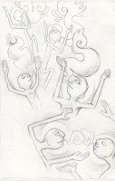
"Who" are our letters?...
---I also can't ignore that one today doesn't see letters as praying figures or Godly suns. The most beneficial alphabet system we've been able to design is boiled down, as I mentioned above, to the symbolism of sounds, of vowels and consonants. With these, we can write anything and identify sound with image, filling it with value. It is so engrained in our understanding of letters today that seeing a letter fills us with the understanding of their pronunciation.
R R R R R R R R R
O O O O O O O O O
A A A A A A A A A
For this reason, for the more present understanding of letters, I want to focus on their ultra-secular connotation of sound. I might arrange shapes of mouths creating different pronunciations of a vowel around the letter itself as a minimalistic, modern representation of the letter.
Where are our letters going?...
---Will be the fun one. I might take a letter, consider a different connotation we have with it (outside of its pronunciation, which I understand is a simplification of how we understand letters today), then morph it and shape it into a pictograph again. A "T", for example, might be equated to a t-shirt, since the object and symbol reflect one another. Perhaps as language progresses, the "t" might assimilate to object so that the symbol literally stands for the shirt... then, perhaps, the symbol of a shirt is directly connoted to mean a male who might wear the shirt, or perhaps the cotton that went into the shirt (as opposed to whatever material might be used for other clothing material), or perhaps for "clothing" on a whole. This progression from alphabetic into heiroglyphic and into pictographic form of representation is perhaps suggestive of a regression in the future to a more rudimentary society (which needs a less-sophisticated written language), which may not have any real proof to validate this extrapolation of progress. However, the conceptual idea is to make more real the progress of the past letters,to suggest the ability of letters to morph and alter thanks to the needs of the civilization at any time. The "T" is by no means static.
(How convenient that there are 3 posters to be done in all!)
Ever emanating the rascally Paul Gauguin, I think the three temporal forms of the transformation of the alphabet are the most fascinating, as they're all contained in the finite source of any given character and its recorded past: the all-encompassing title "Where did we come from? Who are we? Where are we going?" comes to mind when looking at our language through a letter, fleeting in form and timeless in impact. Each letter can be explored for its role in the past, present and future, and each of these periods carries a sort of philosophy with it, a focus that I'd like to explore a little further.
Where did our letters come from?...
---I really liked the concept of letters being born of pictographs and heiroglyphs from ancient civilizations, and I was fascinated further to think that these basic forms can disperse into different letters in different cultures. Symbols for objects or ideas are collected by the rudimentary civilizations, then contorted and twisted and tilted and squished into something more basic: the written form of an object becomes the written form of a sound, of an utterance of the mouth--- in this grand process eschewing bits and pieces of the original form's objective meaning, but still echoing it just slightly for those who really know how to read them.
I found it beautiful, to use that audacious and wonderful term, that most of the civilizations producing early alphabets and series of pictographs attributed them to the divine, that this kingly gift was a way of communicating, of consolidating ideas, from eternalizing conversation with God. Letters, for the most part, were soaked in spirituality in form and in philosophy; in the same way that our letters and even some of our basic enunciations are linked to the past, I wanted to indicate that the spirituality behind them and the link to God that they emanate is not lost. To do this, I want to embody the pictorial form preceding letters in one of my posters.

"Who" are our letters?...
---I also can't ignore that one today doesn't see letters as praying figures or Godly suns. The most beneficial alphabet system we've been able to design is boiled down, as I mentioned above, to the symbolism of sounds, of vowels and consonants. With these, we can write anything and identify sound with image, filling it with value. It is so engrained in our understanding of letters today that seeing a letter fills us with the understanding of their pronunciation.
R R R R R R R R R
O O O O O O O O O
A A A A A A A A A
For this reason, for the more present understanding of letters, I want to focus on their ultra-secular connotation of sound. I might arrange shapes of mouths creating different pronunciations of a vowel around the letter itself as a minimalistic, modern representation of the letter.
Where are our letters going?...
---Will be the fun one. I might take a letter, consider a different connotation we have with it (outside of its pronunciation, which I understand is a simplification of how we understand letters today), then morph it and shape it into a pictograph again. A "T", for example, might be equated to a t-shirt, since the object and symbol reflect one another. Perhaps as language progresses, the "t" might assimilate to object so that the symbol literally stands for the shirt... then, perhaps, the symbol of a shirt is directly connoted to mean a male who might wear the shirt, or perhaps the cotton that went into the shirt (as opposed to whatever material might be used for other clothing material), or perhaps for "clothing" on a whole. This progression from alphabetic into heiroglyphic and into pictographic form of representation is perhaps suggestive of a regression in the future to a more rudimentary society (which needs a less-sophisticated written language), which may not have any real proof to validate this extrapolation of progress. However, the conceptual idea is to make more real the progress of the past letters,to suggest the ability of letters to morph and alter thanks to the needs of the civilization at any time. The "T" is by no means static.
Artist Focus: Roch Forowicz

Refreshingly simple in concept and execution, the most prominent work of Roch Forowicz, "looking," is just that. In 2006, the young Polish artist set up a video camera outside the window of his home apartment and consequently set up the online project which broadcasted the content he caught on film. The material is organized into what the artist calls "parts," including 7 in all; they are medium- to low-quality documentations of situations occurring outside what the artist insists is the same window, each lasting several minutes in length. They have titles of what seems to be the main "point" or situation within the film clip. The scenes are relatively monotonous and grow a bit boring for the average viewer, but they surely were chosen for their intrigue, being out-of-the-ordinary situations (such as "Death in the city," the first part, which includes police officers hovering over a body of a man laying on the ground) or being strangely personal and almost intrusive (such as "Classic Bench," the fifth part, which documents two men sitting on a bench, conversing and commenting on things and characters that pass them by). In the artist statement on the website, Forowicz assures the visitor that this site was not intended to be voyeuristic (not about "crime [or] love"), but the power of simple observation to appreciate the "drama" occurring in ordinary life, particularly when we take for granted fabricated dramas to bring us entertainment.
I realized that the majority of my impatience when observing Forowicz's work likely stemmed from the fact that I was expecting the fabricated sort of drama. I was attuned to constant thrills and exciting details that were made available to me through a screen, with characters that were knowable and change rapid enough to demand (not just politely suggest) my attention. I was hardly even willing to look at a potential crime scene with a (likely) dead body laying on the ground for the monotony!-- surely this was not a problem with the content presented, but my conditioned patience. If the contrast was what Forowicz intended to become painfully clear in "looking," he achieved it.
I feel strongly that "looking" is successful on other fronts in a wonderfully fresh, plain way in comparison to other artists who attempt the same feat of naturalistic observation. Vito Acconci in his early projects of following people with a camera seemed more to be bringing more attention to his own strangeness, the ridiculousness of his actions with any message he wanted to make about publicity of appearance somewhat brushed over. Forowicz doesn't intend to decorate his observation with unacceptability in his actions. He observes, and allows others to observe by placing his findings on the most accessible source known to us currently, the internet. He advertised himself with fliers, as well, so his website might get better publicized. In this light, his objectives for this project are refreshingly simple: he wanted to make the private public and the transitory frozen and duplicated. It is effective as a haiku and, given the patience, quite satisfying.
little thought...
Maybe I'm giving too much thought to this layout and connotation of a poster form. Maybe I should focus on making an artwork that just so happens to be as small and as disposable as a poster.
But even then, I admit I'm a little paralyzed by this project. Most of my thoughts on the alphabet and its parents are not really as emotion- or opinion-driven as most artwork tends be. Why not just write my thoughts? The idea would be clearer.
Back with further conceptualizations later. Hopefully I've exorcised all the misgivings out of my system and can just focus.
But even then, I admit I'm a little paralyzed by this project. Most of my thoughts on the alphabet and its parents are not really as emotion- or opinion-driven as most artwork tends be. Why not just write my thoughts? The idea would be clearer.
Back with further conceptualizations later. Hopefully I've exorcised all the misgivings out of my system and can just focus.
Wednesday, March 4, 2009
A culmination of thoughts on the Alphabet project after the snow days...
I assure you that this isn't the first I've given this project any thought. I'd be in for it if this was. I've let the idea wash around in my mouth for a while and allowed it to grow before formally posting a blog entry... perhaps I'm just not used to the blog format enough to comfortably post thoughts as they occurred.
The idea was to concern the procession of an English-language letter back to Greek, Roman, even Phoenician or Semitic roots in history. Our alphabet is far from static, having evolved from pictorial symbol through a series of abstractions to produce the letter we have today with a relatively rich genealogy behind it. The idea, to be frank and subjective, is relatively interesting but rather finite and unapplicable. Sure, the letter "A" may have "evolved" from a previous form. That form may once have meant this or that and has become refined and restructured to symbolize the sound made at the beginnings of "apple," "avery" and "awning" combined. I guess one might be interested to know the history and the implications of its pictorial state, and one might be gently reminded of it whenever reading or writing letters. It's viable. But for a poster? Let's think more about this.
The proposed outlet for exploring this idea was to create three posters for three different letters of the alphabet, of our choice or based on the letters of out names. Now, for me, posters are very specific artistic outlets. A poster is made to hang on a wall, often temporarily; it might be framed, I suppose, if it was signed or particularly special, but in general a poster is a low and very disposable object typically not thought of as art. Art has a weighty connotation of self-sufficiency in idea, and posters, on the other hand, are typically not created for their own sake. They attempt to convey a persuasive message as they hang temporarily: the most common posters that come to my mind are...
--advertising posters. These give information and attempt to present subjects (being a music venue, a show, a product, even an idea like a public service announcement) in an appealing way.
--bedroom posters. These make more apparent something the owner likes or identifies with. These might feature rock bands, motivational images/text, souvenirs from places like Yellowstone or Oxford, movie posters, reproductions of art, humorous displays of text and image (like the Ten Commandments of College which mostly involve beer pong).
--classroom posters. These give information as reference; the wall is a convenient place to see them and use what's on them. (ie the periodic table, a diagram of a biological system or process, lists of literary devices, the color wheel)
Any poster I made for this project, I reasoned, would have to do something like one of these, and more specifically, be read as one.
At first, this combination of idea and outlet baffled me. Honestly, it even annoyed me. A poster, one that advertises or displays interest or information, does not seem like the first media of choice for exploring the subject matter. How utilitarian the poster is--- and how unexpected is the rather obscure idea of alphabet genealogy! It is easy to imagine placing the entire alphabet and the entirety of its 4 or 5 predecessors on a poster in a diagram form for a linguistics class, but that takes care of only one poster and is insufferably boring... and unfortunately, we must focus only on one letter per poster, and I feel that an informative poster of any one letter would be rather trite if not surrounded by its 25 brothers. I suppose personalizing posters with someone's first initial could make it a poster of interest that one might hang in their room, but realistically, the market for nerdy, female linguistics students seems too small to make a poster and expect it to be convincing. And the idea of making an advertisement poster out of any of these letters is, well, absurd.
I knew I'd have to twist this idea and the make clever use of the poster medium to make this project convincing.
My first idea for my first letter, "T," is based on the persuasive/informational posters seen specifically in the Green Bean cafe in Goodpaster Hall. Sponsored by Equal Exchange, the coffee stand uses posters to nudge customers toward more environmentally- and socially-conscious choices in their coffee consumption. Going in the same vein of informertisement (to use my own linguistic liberties), I might make a poster advising users of the English language to be more conscious of what's in their letters and what the current-day results experienced before reaching the state in which we experience them. I could illustrate it with a tea bag in a mug of water, the leaves disseminating into a brew with mature flavors (in the form of "mature" symbols floating to the top).
Do you know what's in your "T"?
har, har, har.
The idea was to concern the procession of an English-language letter back to Greek, Roman, even Phoenician or Semitic roots in history. Our alphabet is far from static, having evolved from pictorial symbol through a series of abstractions to produce the letter we have today with a relatively rich genealogy behind it. The idea, to be frank and subjective, is relatively interesting but rather finite and unapplicable. Sure, the letter "A" may have "evolved" from a previous form. That form may once have meant this or that and has become refined and restructured to symbolize the sound made at the beginnings of "apple," "avery" and "awning" combined. I guess one might be interested to know the history and the implications of its pictorial state, and one might be gently reminded of it whenever reading or writing letters. It's viable. But for a poster? Let's think more about this.
The proposed outlet for exploring this idea was to create three posters for three different letters of the alphabet, of our choice or based on the letters of out names. Now, for me, posters are very specific artistic outlets. A poster is made to hang on a wall, often temporarily; it might be framed, I suppose, if it was signed or particularly special, but in general a poster is a low and very disposable object typically not thought of as art. Art has a weighty connotation of self-sufficiency in idea, and posters, on the other hand, are typically not created for their own sake. They attempt to convey a persuasive message as they hang temporarily: the most common posters that come to my mind are...
--advertising posters. These give information and attempt to present subjects (being a music venue, a show, a product, even an idea like a public service announcement) in an appealing way.
--bedroom posters. These make more apparent something the owner likes or identifies with. These might feature rock bands, motivational images/text, souvenirs from places like Yellowstone or Oxford, movie posters, reproductions of art, humorous displays of text and image (like the Ten Commandments of College which mostly involve beer pong).
--classroom posters. These give information as reference; the wall is a convenient place to see them and use what's on them. (ie the periodic table, a diagram of a biological system or process, lists of literary devices, the color wheel)
Any poster I made for this project, I reasoned, would have to do something like one of these, and more specifically, be read as one.
At first, this combination of idea and outlet baffled me. Honestly, it even annoyed me. A poster, one that advertises or displays interest or information, does not seem like the first media of choice for exploring the subject matter. How utilitarian the poster is--- and how unexpected is the rather obscure idea of alphabet genealogy! It is easy to imagine placing the entire alphabet and the entirety of its 4 or 5 predecessors on a poster in a diagram form for a linguistics class, but that takes care of only one poster and is insufferably boring... and unfortunately, we must focus only on one letter per poster, and I feel that an informative poster of any one letter would be rather trite if not surrounded by its 25 brothers. I suppose personalizing posters with someone's first initial could make it a poster of interest that one might hang in their room, but realistically, the market for nerdy, female linguistics students seems too small to make a poster and expect it to be convincing. And the idea of making an advertisement poster out of any of these letters is, well, absurd.
I knew I'd have to twist this idea and the make clever use of the poster medium to make this project convincing.
My first idea for my first letter, "T," is based on the persuasive/informational posters seen specifically in the Green Bean cafe in Goodpaster Hall. Sponsored by Equal Exchange, the coffee stand uses posters to nudge customers toward more environmentally- and socially-conscious choices in their coffee consumption. Going in the same vein of informertisement (to use my own linguistic liberties), I might make a poster advising users of the English language to be more conscious of what's in their letters and what the current-day results experienced before reaching the state in which we experience them. I could illustrate it with a tea bag in a mug of water, the leaves disseminating into a brew with mature flavors (in the form of "mature" symbols floating to the top).
Do you know what's in your "T"?
har, har, har.
Tuesday, March 3, 2009
Artist Focus: Olia Lialina

Olia Lialina studied film and film criticism before extending her hand to new media art production, which culminated in the project “My Boyfriend Came Back from the War” (1996). In terms of technological prowess, “My Boyfriend” is relatively low, utilizing techniques very similar to those we have already learned in HTML involving tables and links. The viewer enters the production with the simple white text “my boyfriend came back from the war. after dinner they left us alone.” on a black background. If one clicks the text, one is led to a new, compound image of two pictures, a window and two figures in opposite ends of the screen, both in cruddy quality and black and white against the black background. If one clicks the image of the two seated figures, one is led to a string of links involving text and image (beginning with a close-up of a woman’s face) which exist in a table with now-visible bars separating cells. As the links are clicked, new images and text—which seems to be snippits of dialogue—appear in new boxes or replace them with new cells within the original cell. This growth of cells and change of dialogue text and images creates something of a fractal pattern, leading the viewer forward until all the clicking leaves the majority of the cells blank, with only the original cells (with the window and seated figures) and the last cell with the artist’s information in the bottom right remain.
“My Boyfriend” has become a wildly popular work, with multiple imitations in multiple new media (and even “old” media, like gouache), and for a clear reason: this artwork is not like other works comprising the field of new media art. Not only does it store the majority of its apparent worth and meaning in its visual elements (unlike works like “Telegarden” and “BorderXing”), but it appears to be art-like instead of a potential error or mess of color, like “Jodi.org” might be perceived to be. For a quotidian, non-art-based viewer, “My Boyfriend” is a welcome, organically-artlike change from the I Can’t Believe It’s Really Considered Art! material the contemporary field has been producing. That it is visually appealing certainly doesn’t imply, at least for this viewer, that the work suffers from a lack of deeper thought of which more overtly conceptual work may boast. Lialina outlines something that is far from a linear conversation, far from the soap-opera-esque material the subject matter may otherwise produce. It involves temporal and spatial change in the process of clicking through the links and reading the images and dialogue clips, much in the same way a typical conversation may progress; but since the information that is clicked into is so obviously disjointed, the viewer is gently but firmly advised to read the conversation as something greater than literal. To me, the conversation being outlined is very psychological, the run-through of a very fresh memory and the things seen or focused upon when each phrase was uttered. They change in size related to proportion of importance; they progress not based on when they were said or whom they were said by, but as the situation was experienced mentally later. Once the thought of a phrase has been considered, it is left blank instead of dangling. To me, this implies that the conversation has ended—there is nothing left to be said, nothing overtly undecided about the situation for the characters that experienced it. It is only the viewer left to decide what the result of the conversation was, which keeps the experience compelling. It is specifically through the devices of expansion, of disappearance and the act of clicking, accessible only through the medium of HTML and the internet, that the story gets the meat of its importance.
Subscribe to:
Posts (Atom)